Drogaria São Paulo
Revamp Marketplace In

About Drogaria
São Paulo
Drogaria São Paulo is one of the largest pharmacy retail chains in Brazil and the first to offer 24-hour service. Drogaria São Paulo sells medications, personal hygiene products, and beauty items.
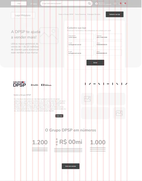
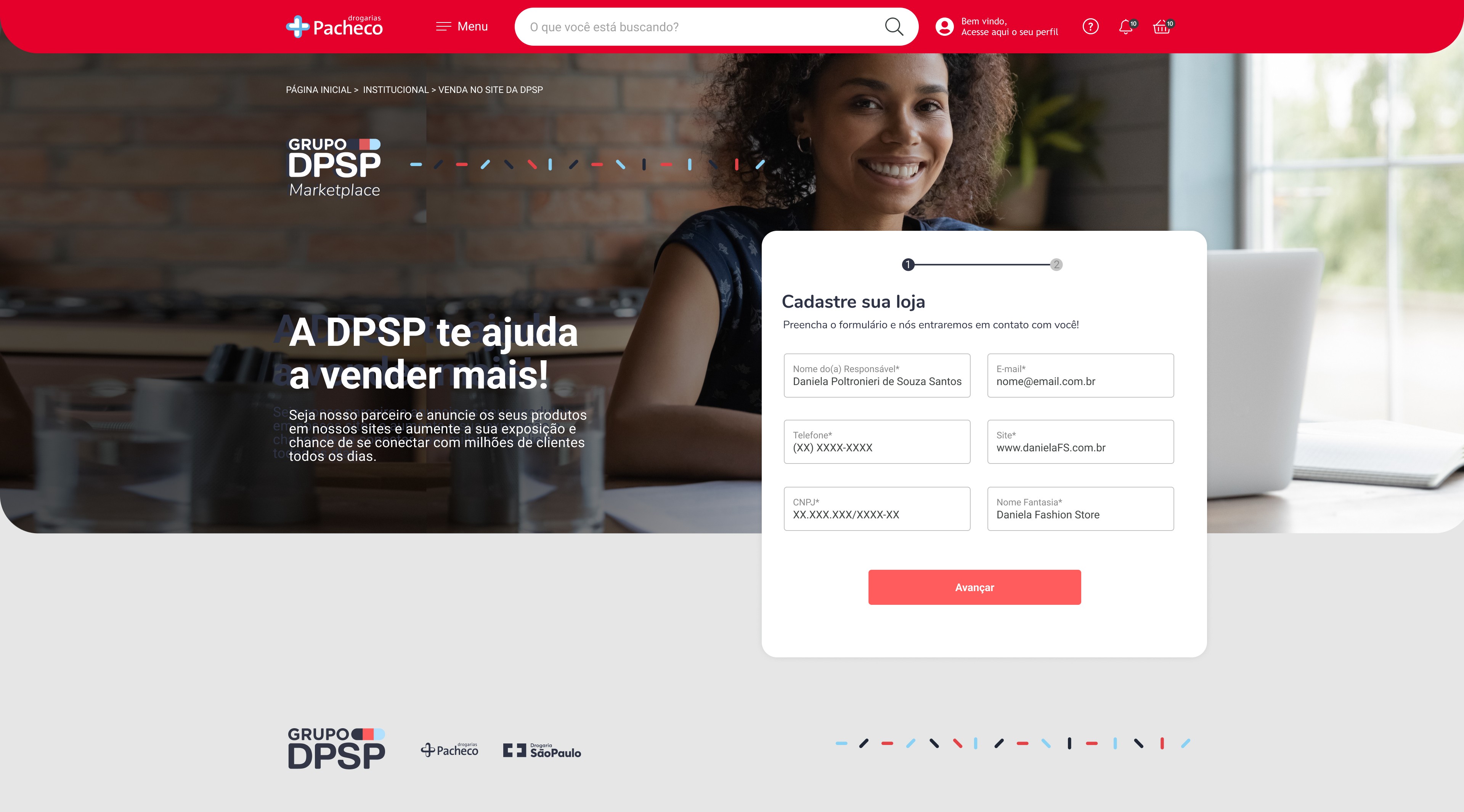
For the LP proposal, we thought about recalling/bringing together the entire value proposition of Drograria São Paulo, aiming to convey credibility to our affiliates. In addition, we focused on making the registration process simple and highly integrated with the back office, bringing the plug and play concept: start selling as quickly as possible. Another interesting point to bring up is the fact that the LP would have to be generic enough for both brands (Pacheco and DPSP), since the Marketplace IN product would serve both markets/brands.
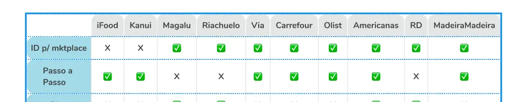
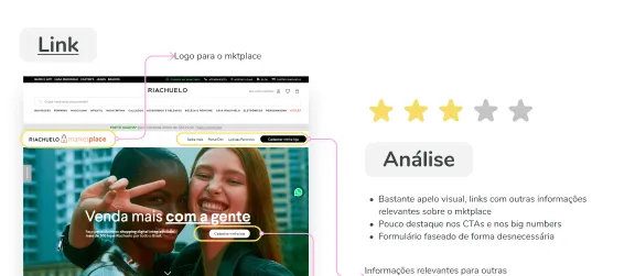
We analyzed a wide range of ecomms (direct and indirect competitors) that had marketplaces, comparing their differences/common points. The LPs of each of these players were also analyzed, which created a basis for the next stages of ideation. In the image below, you can see the approach to analyzing the LPs, where we literally did a review giving “stars” based on the attributes.
Benchmark & moodboard, branding
development and new seller LP
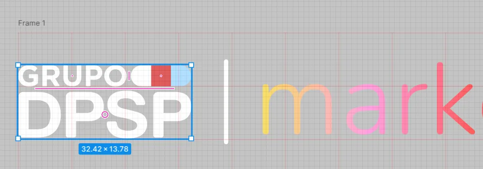
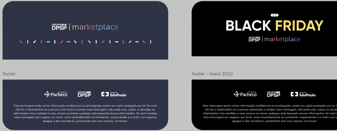
Once the marketplace became an important point of connection between the DPSP brand and other affiliates/brands, it became important to develop a brand idea that would complement the DPSP brand itself and, at the same time, convey the message of increasing the assortment. In this sense, we understood that the gradient in the brand name could convey this message/feeling.
CX Journey Creation
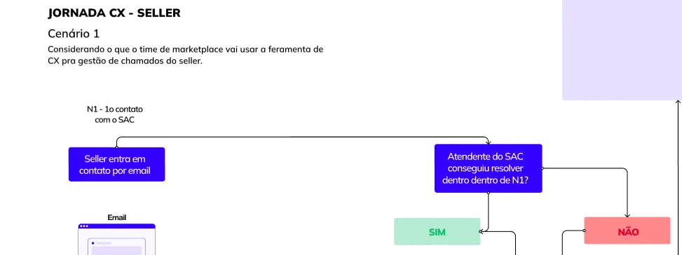
Despite the online journey, a good part of the Marketplace's operational flow would still happen via internal teams. For this reason, we started designing the CX team's journey considering/connecting its touchpoints with the online journey.
Understanding the problem and
presenting the high-level proposal
Initially, we held several discussions with all stakeholders (direct and indirect) involved in the Marketplace in and out process. One of these conversations was mediated through a dynamic to understand what: Works today, Does not work today and Points that would like to improve.
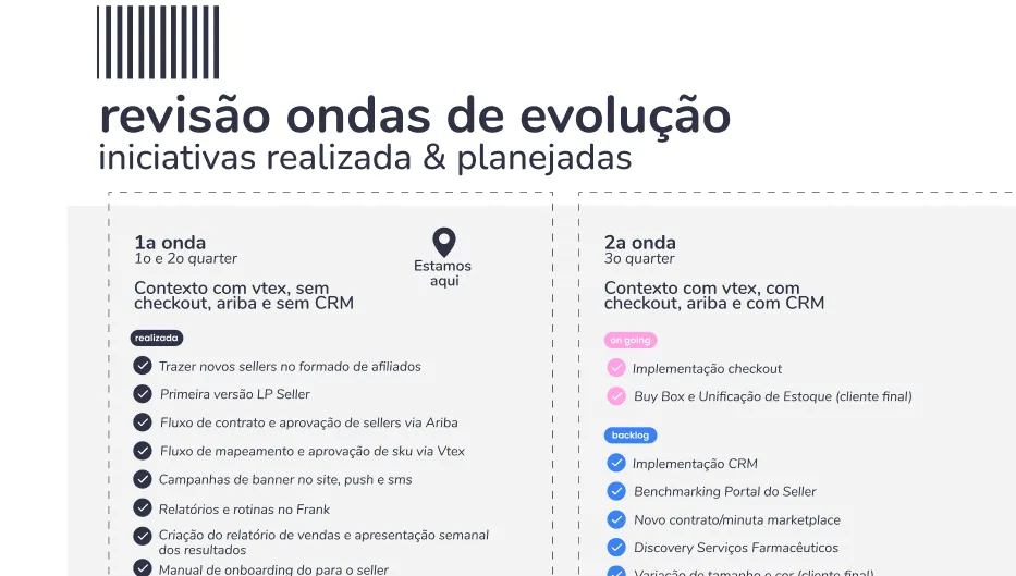
Based on these analyses, we came to the conclusion that we would review the target for 2023 and identify/address the fundamental initiatives to ensure the product scales up in the coming year:
Process
Understanding the problem and presenting the high-level proposal
Creation of the CX journey
Benchmark & moodboard, branding development and new Seller LP
Seller Manual + header and footer for Outlook email
Challenge
Drograria São Paulo was experiencing a significant stockout rate, and the Marletplace In initiative, combined with the initiative of what the logistics sector calls the infinite shelf (the infinite shelf — or infinite display — is a resource that allows companies to sell products that they do not have in their stock. It works in conjunction with another important concept: omnichannel), emerged as an important strategy to reduce these stockout rates.
Redesigning a marketplace is a complex challenge that goes beyond aesthetics—it requires balancing user experience, performance, and business goals. A successful revamp demands a deep understanding of customer behavior, seamless navigation improvements, and a responsive, high-performing interface.
Process
Understanding the problem and presenting the high-level proposal
Creation of the CX journey
Benchmark & moodboard, branding development and new Seller LP
Seller Manual + header and footer for Outlook email
About Drogaria
São Paulo
Drogaria São Paulo is one of the largest pharmacy retail chains in Brazil and the first to offer 24-hour service. Drogaria São Paulo sells medications, personal hygiene products, and beauty items.
Challenge
Drograria São Paulo was experiencing a significant stockout rate, and the Marletplace In initiative, combined with the initiative of what the logistics sector calls the infinite shelf (the infinite shelf — or infinite display — is a resource that allows companies to sell products that they do not have in their stock. It works in conjunction with another important concept: omnichannel), emerged as an important strategy to reduce these stockout rates.
Redesigning a marketplace is a complex challenge that goes beyond aesthetics—it requires balancing user experience, performance, and business goals. A successful revamp demands a deep understanding of customer behavior, seamless navigation improvements, and a responsive, high-performing interface.
Understanding
the problem
and presenting
the high-level
proposal
Initially, we held several discussions with all stakeholders (direct and indirect) involved in the Marketplace in and out process. One of these conversations was mediated through a dynamic to understand what: Works today, Does not work today and Points that would like to improve.
Based on these analyses, we came to the conclusion that we would review the target for 2023 and identify/address the fundamental initiatives to ensure the product scales up in the coming year:
CX Journey
Creation
Despite the online journey, a good part of the Marketplace's operational flow would still happen via internal teams. For this reason, we started designing the CX team's journey considering/connecting its touchpoints with the online journey.
Benchmark &
moodboard,
branding
development
and new
Seller LP
Once the marketplace became an important point of connection between the DPSP brand and other affiliates/brands, it became important to develop a brand idea that would complement the DPSP brand itself and, at the same time, convey the message of increasing the assortment. In this sense, we understood that the gradient in the brand name could convey this message/feeling.
Seller Manual
+ header and
footer for
Outlook email
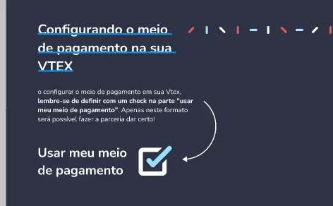
The Seller's Manual, in addition to being very educational/functional and allowing users to quickly find information, would also function as a kind of welcome kit sent along with the email after the registration is completed. In this sense, it starts with a warming message. Next, in the functional content, we prioritize the use of visual resources, using textual resources only when they are very relevant.
We analyzed a wide range of ecomms (direct and indirect competitors) that had marketplaces, comparing their differences/common points. The LPs of each of these players were also analyzed, which created a basis for the next stages of ideation. In the image below, you can see the approach to analyzing the LPs, where we literally did a review giving “stars” based on the attributes.
For the LP proposal, we thought about recalling/bringing together the entire value proposition of Drograria São Paulo, aiming to convey credibility to our affiliates. In addition, we focused on making the registration process simple and highly integrated with the back office, bringing the plug and play concept: start selling as quickly as possible. Another interesting point to bring up is the fact that the LP would have to be generic enough for both brands (Pacheco and DPSP), since the Marketplace IN product would serve both markets/brands.
About Drogaria São Paulo
Drogaria São Paulo is one of the largest pharmacy retail chains in Brazil and the first to offer 24-hour service. Drogaria São Paulo sells medications, personal hygiene products, and beauty items.
Challenge
Drograria São Paulo was experiencing a significant stockout rate, and the Marletplace In initiative, combined with the initiative of what the logistics sector calls the infinite shelf (the infinite shelf — or infinite display — is a resource that allows companies to sell products that they do not have in their stock. It works in conjunction with another important concept: omnichannel), emerged as an important strategy to reduce these stockout rates.
Redesigning a marketplace is a complex challenge that goes beyond aesthetics—it requires balancing user experience, performance, and business goals. A successful revamp demands a deep understanding of customer behavior, seamless navigation improvements, and a responsive, high-performing interface.
Process
Understanding the problem and presenting the high-level proposal
Creation of the CX journey
Benchmark & moodboard, branding development and new Seller LP
Seller Manual + header and footer for Outlook email
Understanding the problem
and presenting the
high-level proposal
Initially, we held several discussions with all stakeholders (direct and indirect) involved in the Marketplace in and out process. One of these conversations was mediated through a dynamic to understand what: Works today, Does not work today and Points that would like to improve.
Based on these analyses, we came to the conclusion that we would review the target for 2023 and identify/address the fundamental initiatives to ensure the product scales up in the coming year:
Seller Manual + header and footer for
Outlook email
The Seller's Manual, in addition to being very educational/functional and allowing users to quickly find information, would also function as a kind of welcome kit sent along with the email after the registration is completed. In this sense, it starts with a warming message. Next, in the functional content, we prioritize the use of visual resources, using textual resources only when they are very relevant.
See some details
Mariana souza
Senior UX Designer, currently crafting experiences at Catho

Think I’d be a good fit for your team or project? Let’s connect.
Let's connect?
Email copied!
Selected projects
Catho: MVP Catho Express
Drograria SP: Revamp Marketplace In
Órigo: Customer Portal Redesign
Freelance: Freelance Works
Mariana souza
Senior UX Designer, currently crafting experiences at Catho
Think I’d be a good fit for your team or project? Let’s connect.
Let's connect?
Email copied!
Selected projects
Catho: MVP Catho Express
Drograria SP: Revamp Marketplace In
Órigo: Customer Portal Redesign
Freelance: Freelance Works
CX Journey Creation
Despite the online journey, a good part of the Marketplace's operational flow would still happen via internal teams. For this reason, we started designing the CX team's journey considering/connecting its touchpoints with the online journey.
Benchmark & moodboard,
branding development
and new Seller LP
Once the marketplace became an important point of connection between the DPSP brand and other affiliates/brands, it became important to develop a brand idea that would complement the DPSP brand itself and, at the same time, convey the message of increasing the assortment. In this sense, we understood that the gradient in the brand name could convey this message/feeling.
We analyzed a wide range of ecomms (direct and indirect competitors) that had marketplaces, comparing their differences/common points. The LPs of each of these players were also analyzed, which created a basis for the next stages of ideation. In the image below, you can see the approach to analyzing the LPs, where we literally did a review giving “stars” based on the attributes.
For the LP proposal, we thought about recalling/bringing together the entire value proposition of Drograria São Paulo, aiming to convey credibility to our affiliates. In addition, we focused on making the registration process simple and highly integrated with the back office, bringing the plug and play concept: start selling as quickly as possible. Another interesting point to bring up is the fact that the LP would have to be generic enough for both brands (Pacheco and DPSP), since the Marketplace IN product would serve both markets/brands.
Seller Manual + header
and footer for Outlook email
The Seller's Manual, in addition to being very educational/functional and allowing users to quickly find information, would also function as a kind of welcome kit sent along with the email after the registration is completed. In this sense, it starts with a warming message. Next, in the functional content, we prioritize the use of visual resources, using textual resources only when they are very relevant.
Outcomes
The Seller's Manual, in addition to being very educational/functional and allowing users to quickly find information, would also function as a kind of welcome kit sent along with the email after the registration is completed. In this sense, it starts with a warming message. Next, in the functional content, we prioritize the use of visual resources, using textual resources only when they are very relevant.
See some details
Mariana souza
Senior UX Designer, currently crafting experiences at Catho
Think I’d be a good fit for your team or project? Let’s connect.
Let's connect?
Email copied!
Selected projects
Catho: MVP Catho Express
Drograria SP: Revamp Marketplace In
Órigo: Customer Portal Redesign
Freelance: Freelance Works
Think I’d be a good fit for your team or project? Let’s connect.
Let's connect?
Email copied!
Let's connect?
Email copied!
Selected projects
Catho: MVP Catho Express
Drograria SP: Revamp Marketplace In
Órigo: Customer Portal Redesign
Freelance: Freelance Works